Showing posts with label Art. Show all posts

Tuesday, April 9, 2013

Art Exhibits High At The Getty Center

The Getty by Richard R. Becker
Rising high above the Los Angeles skyline in Brentwood is a museum with one of the most impressive art collections anywhere. To get there, guests are asked to leave their vehicles behind and catch the three-car cable pulled tram that ascends and descends the hill every day. The winding route takes five minutes.

Almost 1.3 million people take the journey every year to see one of the finest collections of pre-20th century and 20th century European and American art. Housed in five exhibition pavilions that make up the campus, the Getty Center itself is a work of art, meticulously designed by architect Richard Meier.

Meier took special care in considering how people would arrive and orient themselves. The museum itself extends south along one of two ridges that converge to make up the campus. Once they arrive, they have an immediate choice to explore the grounds or enter the museum through the three-story cylindrical lobby that opens onto the museum courtyard, which is surrounded by those buildings.

"Not all those who wander are lost." — J.R.R. Tolkien

Although not written for the Getty Center, the timeless Tolkien quote conveys the right sentiment. This is the kind of place to wander for hours and lose yourself despite never being lost. Around each and every corner of every circling pavilion, the work of master artists, painters, artisans, and craftsmen are everywhere, usually with statues and artifacts on the first floors and paintings on the second floors.

Inside The Getty by Richard R. BeckerWith many beginning in the North Pavilion, guests will find art, sculptures, and illuminated manuscripts. The majority of the collection in this pavilion pre-dates 1700, with an emphasis on medieval art. After transversing the lower and upper levels, a sky bridge connects the North and East pavilions.

It is in the East Pavilion where visitors will find increasingly familiar artists, with Dutch, French, Flemish, and Spanish paintings as well as sculpture and Italian decorative arts dating from 1600 to 1800. The highlight of the collection, however, is the 17th century Baroque art.

Immediately between these buildings and easily missed while wondering into the South Pavilion is a small standalone building that holds what the Getty Center calls The Family Room on the first floor. It is one of several places where the Getty lives up to its mission to inspire curiosity about the visual arts, inviting younger visitors to construct their own interpretation of an illuminated manuscript, build tube structures, and enjoy treasure hunts.

The Getty Museum is evolving on site and off site with apps.

Further back, however, is another Getty Center rarity. The South Pavilion contains the museum's 18th century paintings and a majority of the museum's European decorative arts collection. What makes the collection especially interesting is that some of the exhibits are done up in finished rooms, elaborately furnished and paneled.

Getty App
It was one of the Getty Center's interactive exhibits that inspired The Life Of Art, an iPhone application that details how four decorative works maintained at the museum came together, with various artisans each adding their expertise to create the elaborate furnishings. The app, much like the exhibit, includes a lidded bowl, silver fountain, side chair, and wall light.

The application isn't exclusive. The J. Paul Getty Trust has produced other free apps, including one to coincide with its exhibit Florence At The Dawn of Renaissance. The visiting exhibit is tied to how Florence flourished in the 1300s and helped set the stage for the Renaissance.

In addition to its own apps, other developers have created some.

In keeping with the desire to inspire, several other apps have been undertaken by other developers. In 2001, Toura created an app that featured highlights from four exhibits. And another by the same developer features 150 stunning works at the collection. It is the only one that requires a purchase, but does include some of the famed paintings from the West Pavilion, including Van Gogh.

Chicken by Richard R. Becker
Even more remarkable is the museum's recent exhibit on Pinterest, with almost 1,700 works. Still, even if these drawings, paintings, and photographs capture representations of the work, there is nothing like the real thing. The fountains, architecture, cactus garden, and central garden designed by artist Robert Irwin all converge to transport anyone away from Los Angeles for a few hours or even a day.

The Getty has several options for eating. In addition to light fare snack carts, the center has a restaurant and semi self-serve cafe (pizza oven and hamburger/chicken grille). While the restaurant menu seems pricey at a glance, the preparation and presentation is exquisite, as fine as any leading Los Angeles eatery. Plan to eat in, with dinner equally distinguished.

The Getty Center In Los Angeles Rises To 9.9 On The Liquid Hip Richter Scale. 

The Getty Center and Getty Museum has been a favored place to visit in Los Angeles since it opened. Given the museum waives its admission like several Los Angeles museums and art galleries (there is a modest $15 for parking), there really isn't any reason to miss it.

For a complete overview of travel accommodations in Los Angeles, compare top travel deals at Expedia.com. The Getty is especially close to Santa Monica (and you can avoid any highways). For a virtual tour of the Getty, you can find The Life Of Art, Getty Museum HighlightsFlorence At The Dawn of Renaissance, and Pacific Standard Time on iTunes. Three of the apps are free.

Tuesday, March 26, 2013

AnyForty Makes A Five-Year Statement

Five years ago, AnyForty opened up shop in London with the hope of inspiring the UK streetwear scene with various artist collaboration projects. The original idea began a few years prior when Alan Wardle received a pirated cassette tape of NWA's Straight Outta Compton when he was 12 years old.

It was the original cassette that begin his obsession with U.S. hip hop culture. It became especially prominent after he picked up his first full-time job. It was costly to stay current with big brand names.

"I’ve had a 13-year design career behind me. Ten years in editorial design, working for magazines such as Max Power Magazine, PlayStation and Computer Arts Projects," he told SQ magazine last year. "The last two years of my life have seen me balancing AnyForty alongside freelance work."

Hearing Wardle say it, it wasn't easy. It took him some time to work into design. And even after scraping together enough money to attend an art and design college, it was a few years before he really took in what his professors were trying to teach him. Before that, he says, he was a dickhead.

A new line of AnyForty streetwear is sharp this spring or summer.  

Few people would say that about him now. In fact, the newest line of designs being displayed at AnyForty does something that many streetwear concepts do not. They transcend hip hop and start to encompass a bigger indie scene, with shirts that play to punk and rock as much as hip hop.

The crux of the concept is simple enough. AnyForty put out a 12-series collection of designs (two of them as in-store exclusives). The designs were purposefully bold as a celebration of its five-year anniversary. According to the AnyForty team, it is all about the blood, sweat, and hard work.

Some of the designs that stand out include an ode to Greek mythology by Vanilla BCN. According to Rick Nunn, they wanted to join Escher with Greek gods to makes truly memorable shirts. The art is powerful, which is why it is included as the hero shot above.

Although the entire series of twelve is worth checking out, two more standouts from the collection include another by Mr. Gauky and another by Niark1. Both designers have considerable talent, and their involvement with AnyForty is appreciated because it makes art accessible.

If you have never heard of either artist, Niark1 is Sebastien Feraut, a French graphic designer based in Paris. He is equally comfortable with computers and brushes, making crazy universes and geometric shapes. The AnyForty pick is a favorite.

Mr. Gauky is somewhat the same, an artist who seems comfortable doing it all. He takes on jobs that range from illustration to 3-D modeling. Although he spent much of his youth on a skateboard, he eventually turned his character art into a career after one of his friend's mothers (an art teacher) convinced him to pursue an education in art and design.

Other designers that stand out in this collection include Tom Mac, Richt, Mr. Bowlegs, and iLK & Gorey (among others). All together, it makes a statement for streetwear in that it takes it well beyond its hip hop roots and right into modern art.

AnyForty Makes A Five-Year Statement At 6.5 On The Liquid Hip Richter Scale.

As a long-time fan of European streetwear that is less likely to be found stateside, I have a special appreciation for the artists highlighted at AnyForty. In some cases, they have taken a style that began in the United States and made it their own (if not global). It's part art, part fashion, and always smart.

You can find most designs from AnyForty at Urban Industry, with the exception of in-store exclusives. For everything else, visit the shop direct. With the exception of the Blood, Sweat, and 5 Years design (which is an anniversary shirt), the balance of the collection is a striking mix of art from some remarkable artists around the world.

Friday, December 28, 2012

FlipBooKit Rekindles Kinetic Motion Art

The first thing that comes to mind when anyone mentions a "flip book" is its origin as a primitive form of animation. But after the initial spark, individual memories vary.

Some people remember making doodles in the corners of a notebook starting in grade school. Others recall picking their first flip book out of a box of Cracker Jacks. A few might think about those vintage coin-operated machines that used to be commonplace at amusement parks, one of the earliest forms of moving pictures.

It's something between the latter design, a mutoscope by Herman Casler, and a later invention, the filoscope by Henry William Short, that inspired artists Wendy Marvel and Mark Rosen to recreate an artistic exhibition based on the motion studies of Eadweard Muybridge. By placing flip books in a hand crank or mechanized box, Marvel and Rosen could tell artistic stories in 24 frames.

FlipBooKit marks a resurgence in kinetic arts. 

The result was a stunning series of gallery-caliber work, featuring original motorized flip books made out of found objects. But as the work was exhibited and well received, Rosen and Marvel discovered they did more than resurrect a kinetic art form. They were at the forefront of rekindling a lost medium.

With so many people interested in telling their own 24-frame stories, Marvel and Rosen began to kick around the idea of a DIY kit that would make the medium more accessible. To make this dream come true, they enlisted the help of former Disney Imagineer Steven Goldstein. 

Goldstein, a product designer with more than a dozen patents, worked with these artists to make mass production possible. Inside every kit, would-be artists could find a buildable box, hand crank spindle, and 24 frames to tell any story they might think up. 

What's inside the FlipBooKit. 

The development team (Marvel, Rosen, and Goldstein) turned to Kickstarter and cut a few corners to ensure early backer kits would arrive before their Christmas deadline. So it is very likely that only the first recipients will ever notice it. While the kits are complete, none were shipped with packaging to hold everything together.


Instead, the entire kit slipped right out of the shipping envelope. It included the die-cut notebook plastic encased cardboard box that folds together in about five steps. It included a spindle assembly, which has a hand crank. And it includes two sets of laminated flip cards, plus a set of stickers. 

The first set of flip cards sport the classic image of a running horse. The second set is blank, allowing anyone to either affix their series to the cards or draw/print images on precut stickers. (It pays to be careful in removing the contents as some cards will separate from their sheets.)  

It may seem slightly daunting as the contents fall out of the envelope, but the instructions make sense. All told, most people can assemble the box with the preprinted horse frames in about 28 steps. Making their own creations, however, requires considerably more thought. 

The creativity of motion media is limitless. 

Much like the artists discovered in creating their own work, one box with a 24-frame story can be interesting. However, stories that sprawl across more than one box are even more memorable. In looking at the work of Marvel and Rosen, many of their motion vignettes sprawl across three boxes — either in a horizontal row or with other spatial considerations. 

Ergo, a horse running in place is interesting, but a horse running from one box to the next can be all the more captivating. Or, as Marvel and Rosen's work have shown, a woman climbing up a ladder and diving into a tub or an elk walking across two boxes before transforming herself into a woman can be unforgettable. 

But then again, depending only on someone's imagination, anything might be unforgettable in the span of 24 linear or looping frames. We can see anything and everything from a series of stills to time lapse photography playing out in an endless loop. With enough foresight, someone could even capture themselves in the same position for 24 years and age themselves with the turn of a crank.

FlipBooKit Moves Art Toward Motion At 5.8 On The Liquid Hip Richter Scale. 

FlipBooKit is still in its infancy, with the next rounds likely to ignite something lasting more than the first round. In other words, the development team has a few kinks to clean up. The kits deserve better packaging and a spare spindle assembly. The upcoming motorized kits might require programmable timing (like the work on exhibit). And the materials used in making the box ought to include metal or wood, which many people are already expressing a willingness to pay more for. 

There is also plenty of room for preassembled boxes, where the artist is only responsible for adding content to spindle cards, which could be sold as cartridge kits. These might seem like small changes, but could eventually make all the difference — especially as others build upon the work of Marvel and Rosen to prove what's improbable can also be possible. 

Currently, FlipBooKits are only be sold direct through the bigcartel. They are modestly priced at $43 per kit. They are especially attractive to anyone who sees potential around the corner, artists and creatives that want to move into the kinetic arts medium rather than confining themselves to the digital space. Sometimes art needs high touch and low tech as opposed to the other way around. 

Tuesday, November 20, 2012

Digital Photos Take An Analog Turn

Photo To Art
Smart phones and digital photography may have revolutionized how people take pictures, but it hasn't changed how people want to see them. Passing around a smart phone or scrolling digital files isn't it.

People appreciate print. And print has taken on a new meaning in recent years. There are dozens of developers working to deliver more diversity in digital photo output. Several have caught our eye, but Art.com, which originally specialized in vintage art posters and prints, has developed one of the newest ready for review.

Photos [To] Art app is free. Ordering is optional.

The Photos [To] Art app is a first generation digital-to-print application for iPhone, iPad, and iPad smart phones. Call it "first generation" because it isn't perfect. It's a promising work in progress.

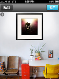
The application was designed specifically to help people print photos to canvas, wood, or poster prints. This concept isn't necessarily new, but the application simplifies the process because the photos can be uploaded directly from your phone from either your camera roll or Instagram account.

The prospect is promising, but there are limitations. Although the application supports a variety of sizes from 8"x10" to 20"x30", the size is dependent on the photo format and quality. The allure of printing Instagram photos, for example, is limited, typically rendered at 12"x12" or 16"x16", which is especially important to know if you are hoping to create a series of three or more photos of the same size.

For more sizing options, the application prompts members to upload the shot from the camera roll (assuming the shot wasn't taken through the Instagram app). Most photos are then rendered at four or five sizes, with can be viewed against three mock living areas or on the actual wall where you intend to hang it. The latter feature is pretty clever, even approximating how far away you are from the wall.

Photo To Art
Although the limitations might seem annoying at first, it doesn't take long to adjust for output. The primary reason Art.com is a bit restrictive is because quality is the priority, especially with a 30-day satisfaction guarantee policy. For more flexibility, the web platform has some flexibility.

Specifically, the web platform provides some limited cropping and resizing (horizontal or vertical adjustments) options and allows you to save up to 10 photos for 30 days. In contrast, the application assumes all cropping is complete and saves only one photo at a time. It may also be possible to sync the mobile app with a web platform account, but I couldn't find it.

A few graphs about Art.com and its growing family of apps.

Lord of the Rings from Art.com
The Photos [To] Art app easily makes up for any limitations for ease of use and high quality outputs delivered, which has always been the objective of founders Michael Heinstein and Brandon Carr. They started with a single "poster" site concept and a small room in Berkeley, with nothing much more than a modest capital investment from the founders and a sympathetic relative.

Not even 15 years later, the rebranded Art.com and several sister sites have grown to become the largest poster and print producers in the world and includes one of the largest masters collections. They have developed two other apps: artMatch, which helps people find similar artistic styles by snapping a picture of any art; and artCircles, which is an iPad art curation tool that features artist picks along with any self-made collection.

More analog offerings from developers on the horizon.

The ability to order self-made prints from any mobile device is not an exclusive fix for analog. Three other projects in development that have caught our eye include the Impossible Instant Lab, which turns iPhone photos into instant Polaroids; Instacube, which ports photos directly from Instagram into digital frames; and Projecto, which transforms eight Instagram photos into a slide wheel that can be projected from a projector about the size of a matchbox. The latter concept convinced us to become a backer.

Photos [To] Art App By Art.com Prints 4.6 On The Liquid Hip Richter Scale. 

While Photo [To] Art has room for improvement, having personal photographs or artwork transferred to framed prints, wood mounts or canvas from a mobile app is a step in the right direction. Art.com keeps its pricing reasonable, with unmounted poster prints starting at under $4 (8"x10"). Canvas runs considerably higher, depending on size.

You can download Photo [To] Art from iTunes. The app has already been optimized for iPhone 5. It also works with iPhone 3GS or better as well as some iPods and iPads. The app is a free download, perfectly timed to take pictures over Thanksgiving with enough time to make prints for the holidays.

Friday, June 29, 2012

Juniper Books Redefines A Book Look

Fewer people might have a need for bookshelves since the advent of e-readers and tablets, but printed books don't have to evaporate from the landscape. They may even make a collectible comeback.

Bolder, Colorado-based Juniper Books goes beyond making spaces that fit books and instead helps books fit the space. The brainstorm began with Thatcher Wine, who originally started selling books online in 2001.

Over time, his original concept for an online company took a turn as he started personally designing and curating libraries of leather and vellum books, bring them together by size, author, and subject.

Wine doesn't just arrange the books on a shelf. He invented custom book jackets in 2010, which can span several covers and change the entire look of a home library. Even better, if you don't have the right books for the job, Wine has curated collections and added the jackets for dozens of authors.

A peek inside the mind of a Thatcher Wine collection at Juniper Books. 

A few immediate favorites include the J.D. Salinger Custom Book Set, which includes four books decorated with a tree silhouette; Ernest Hemingway Set, adorned with an elephant and the author's name; and Custom Puffin Classics Collection, which includes the name of the child.

But pre-curated series with dust covers are just the beginning for Wine. He also creates solutions for large collections that are unique to the collector. For example, he wrapped the library inside the Architectural Digest Greenroom with a filmstrip look featuring classic scenes from vintage films.

Most projects are little more straightforward. Some collections (or collections filled by the collector) take on a much more traditional look. There are many sets that include a simulated leather look in brown, black, and red. And Juniper Books has also assembled some collections. (Jack London, Charles Bukowski, John Irving, and Tom Wolfe among them.)

"Our focus is on building book collections and personal libraries," says Wine on the store's FAQ. "We buy books specifically to put them into book collections as opposed to other sellers who might try to get rid of their books in bulk if they do not sell in their store."

Several other creative ideas for books around the web and in other places. 

One of my long-time personal favorites since it first appeared last year comes from San Francisco-based furniture designer Jane Dandy. Her idea was to enable people to send in the dimensions of their favorite books and create custom end tables that fit them perfectly.

While some people were initially concerned that the books stood to endure undeserved wear, I might point out that there is still plenty of table space to avoid putting anything damaging on the books. Or for anyone especially concerned, asking that the books be recessed would allow for a pane of glass to be placed over the top.

If you want something more classic in its approach that still stands out, then Alejandro Gomez Stubbs might have something more functionally creative. After graduating from the Pratt Institute, the Colombian native began designing for Clodagh in New York City.

The bookshelves themselves are cantilevered modules that can be stacked together at a single angle, titled to negate the need for any bookends. The company, Malagana, is still developing its site for online orders. In the meantime, they ask that you send them an email if you are interested in Equilibrium design.

While both solutions are affordable, there are some designs that are slightly more lavish. One of them is Draper Cabinet, an incredibly sophisticated shelf with a vintage look. The shelves are made from handcrafted plantation-grown hardwood and then painted black and red in select areas.

The shelves are very versatile, sold as a set of three or separately. One of the better singles to consider is the horizontal cabinet. For those that are curious, the wood is made from maple. The fixtures that adorn the shelves are an alloy made from copper, zinc, and brass.

Thatcher Wine's Juniper Books Stacks Up At 7.2 On The Liquid Hip Richter Scale.

Juniper Books is really the hero of the story, but the shelves provide additional perspective. It isn't very hard to imagine how the custom covers or collections might fit on any of the highlighted shelves. Despite all the buzz about e-readers and tablets, which I personally love, sometimes it feels good to be able to see, touch, and feel books that are part of the collection. Wine does it right.

Because of the unique nature of Juniper Books, it is best to make contact them with direct. As for the shelves, Jane Dandy retains her contact information on Etsy. The Equilibrium shelves have appeared in several showrooms, but it's best to contact Malagana direct. The remarkable Draper's Cabinet was available from Sundance.

Special thanks to editor Rich Becker for contributing to the review selection. 

Tuesday, June 19, 2012

Let Us Create Is An Arts Good Will Pick

As an early teen, Roger Dixon started painting in a workshop at home. But it wasn't long after that his curiosity propelled him to put his paint brushes aside and see the world.

While he will never regret what he describes as the mistakes and blunders of an optimistic youth traveling across Asia and around the Mediterranean, Dixon eventually decided to make his old passion for art a profession. He returned to painting at the age of 28.

From that day forward, he never stopped painting, realizing he never had to choose one or the other. Although he settled in Ibiza, Spain, Dixon still traveled the world from time to time. And one of those excursions led him to the beaches of Sihanoukville, Cambodia (a.k.a. Kampong Saom), on the Gulf of Thailand.

While Dixon painted, he began to attract an unexpected audience. Area children who would normally comb the beaches attempting to sell merchandise to tourists or beg for money gathered around him. Almost immediately, mostly because Dixon's own career had seen lows that had him living in a tent or traveling with a caravan, he recognized them as homeless children living in extreme poverty.

How a painter sparked the Let Us Create Cambodian Children's Project. 

His heart breaking, Dixon decided to become an advocate for these children. And with the support of a group from Ibiza, a simple project was started in 2004 to give these children drinking water, a meal, and an opportunity to paint. Two years later, another young man from Ibiza took charge of the ongoing effort and registered the project as a self-sustaining NGO.

Today, Let Us Create has evolved into a closed campus. While there is an open door policy for all children, tourists are not welcome. The idea is to ensure that their activities and education remain safe and interactive rather than at risk or exploitive.

The center provides free education, which includes English and Khmer, along with extracurricular activities ranging from karate and yoga to basketball and technology. The center even has a nursery for younger children, which enables older children to attend class.

Along with these services, the program provides basic nutrition and food assistance for some families. In some cases, the children are provided a bicycle so they can travel back and forth to school.

While the children are sheltered, the center subsidizes its needs with art. 

The center's original building, which is located on Serendipity Beach, now serves as an art gallery featuring the work of the school's young artists and other merchandise. The art subsidizes the programs at the center and has led to a program that rewards students for perfect attendance.

Once a week, students are given items they can use for school or take home and share with their families. Originally, the center split sales with the children until discovering it was counterproductive. Some of the children who were especially proficient would give up creative exploration and attempt to paint only what they thought would sell.

Often times, the work is inspired by the various art teachers who have volunteered at the center. Many of them visit from the United Kingdom and elsewhere to serve as volunteer teachers for one to three months.

In addition to the full-time staff, the center has a volunteer application program. Many volunteers live at the center, teaching art and English while overseeing other extracurricular activities for one to three months. Volunteers invest $500 USD to the project per month ($650 for a single room) and the center offers recommendations for how much volunteers ought to plan for meals and other expenses.

For many years, Dixon was one of those teachers while the project became self-supportive. Today, he is working on a new exhibition after the children, he says, inspired his work. Ironically, like the children he has assisted, he doesn't always know when his next painting will sell to sustain a lifestyle with very few frills. You can find his work on a modest website.

The Let Us Create Cambodian Children's Project Is A Liquid Hip Good Will Pick. 

At least once a month, Liquid Hip highlights good will efforts undertaken by people with big hearts. We don't score them. That belongs to you.

Let Us Create Cambodian Children's Project allows sponsors to provide a scholarship to area children for $120 per year per student. This includes English and Khmer classes, uniforms, and all school supplies. There are additional sponsorship opportunities, including $45 per month to help ease the financial burden of student families (alleviating the need for children to work instead of attend school).

In addition to sponsorship opportunities, Let Us Create welcomes individual donations. They include an itemized list of the direct support that provides individuals an accurate picture of precisely where the money will be invested, ranging from school uniforms and art supplies to food and a teacher's wage ($180).

Wednesday, June 13, 2012

Retro Plug And Play: Space Invaders

In 1977, a young Japanese engineering student turned video game developer was given an honor reserved for only a few. The Taito Corporation of Japan asked Tomohiro Nishikado to design a game on his own.

Nishikado took the challenge seriously. Still unsatisfied with the pace of development, he started from the ground up. Not only did he design, program, illustrate, and engineer the sound, Nishikado developed an entirely new microcomputer to serve as a platform for his game. In 1978, Taito put it on the market.

Space Invaders was such a success it caused a coin shortage in Japan.

Inspired by War Of The Worlds, Space Invaders pitted players against several columns of alien enemies that would descend from the top of the screen toward four fortifications at the bottom. The only thing that stood in the way of this endless wave of aliens was a single laser cannon behind the first destructible barricades.

Destructible barricades was not the only innovation of Space Invaders. It was also the first game to introduce "lives," set high scores, employ a continuous soundtrack, and revolutionize the industry as an early first person shooter. The game was so successful that the 360,000 arcade cabinets sent around the world made $1 billion (in quarters) in just three years, $2 billion in four.

Some even speculate that had it not been for Space Invaders (and Pac-Man), the home video market might have crashed. Instead, this roll-of-the-dice development sparked a renaissance that would usher in a golden age. The next wave of innovative games would include Galaxian and Asteroids. Pac-Man earned $1 billion in one year.

Space Invaders is one of several highlights at The Smithsonian this year.

The novelty of Space Invaders still hasn't come to a close. The Smithsonian Art Museum recently launched an interactive exhibit to explore the 40-year evolution of video games as an artistic medium. The exhibit opened in March and will run through September 30. Following its stay in Washington D.C., it will visit ten major cities in the United States, ending at the Patricia and Phillip Frost Art Museum in Miami.


The exhibit is rekindling novelty interest in the Space Invaders plug and play joystick with ten video games from the early era. Manufactured by Just Plug It In And Play, the two-button and single joystick controller connects directly into any television set with audio and video jacks. There is no console.

While Space Invaders is the primary game (with its art decorating the controller), nine other less popular games are included. Some of the vintage games include Alpine Ski, Legend of Kage, Bubble Bobble, and Crack n' Pop (the latter two being predecessors to early adventure maze games).

The best known, of course, is Space Invaders. And although there have been many updates to the game in several years, this controller carries something similar to the original art. Its starkness shines.


For those who don't know, the game is incredibly straightforward. Once the five rows of aliens appear, you shoot them while avoiding their three types of missiles: slow, fast, and wiggly. Each alien type is worth 10 to 30 points (990 points per screen), with mystery ships carrying a value up to 300.

During the golden era of video games, masters developed several strategies, including becoming one with the cadence of the game, shooting the outer layers before the aliens can descend, and blowing small holes in a barrier in order to benefit from protective fire. Some even know that the value of the mystery ships is determined how many times you have fired (seriously.)

Space Invaders Plug And Play Shoots 6.7 On The Liquid Hip Richter Scale. 

While playing Space Invaders today carries some campiness, there is something cool about preserving the game as it was meant to be played. If not in an arcade cabinet, then absolutely for television.

You can find the retro Space Invaders game at The Smithsonian Art Museum (about $35-$40, down from $50). The Smithsonian Art Museum has other discounted gifts as well. A similar plug and play Space Invaders controller is available at Amazon. If you aren't sure about purchasing a controller, there is vintage Space Invaders for the iPhone.

In recent years, other plug and play vintage controllers have also appeared for Atari and another for Super Pac-Man and an Atari collection.  Depending on the manufacturer, some controller games have already become collector items.

Wednesday, May 16, 2012

Charles And Ray Still Inspire Designs

The answer to the question "what's in a chair" inevitably depends on the chair, especially if it was designed by Charles and Ray Eames. There was always something more about the work they started in the 1940s, which is why some furniture designers still aspire to capture it today.

The design of the DCM 1952 might seem simple at a glance for example, but it perfectly balanced form and function. That was part of the goal. When Charles and Ray Eames first started designing furniture for Herman Miller, the architect, artist, and their team wanted to make high-quality pieces that were affordable for average people.

At the same time, almost every piece they made carried an elegant modern look. For some designers, the look and innovations might have been enough. Not for the Eames team. They wanted it to work. 

"What works is better than what looks good," said Ray Eames. "The looks good can change, but what works, works."

All of the Eames designs incorporated shapes to comfortably support the seat and back of the human body. The chair became so collectible that originals aren't easy to find. The chair above (featured by the Eames Office) appears to have been sold from the collection it once belonged to. 

Fortunately, there are some designers who take the time to revisit the concept. The Eames chair, which is considered to be among the most collectible designs of the 20th century (and this century too), has been partially recreated in all wood.

While some variations certainly apply, some do not. For instance, the DCW chair inspired by Eames is all handmade. And even though it moves away from Eames' desire to retain natural wood, the veneer finishes are still striking in black, red, or one of four wood finishes.

The manufacturer does pay attention to detail. In fact, INFURN specializes in producing furniture that was designed between 1900 and 1986. The ones they painstakingly being back to life have all reached iconic status. They carry several other models, but Eames pieces immediately stood out.

As an alternative, we also found another designer that carries the inspired design. The manufacturer is Kardiel, which sells the product for about $100 less. Kardeil does a fine job because they triple sand the surfaces and then and five additional coats of UV polyurethane for protection. Eames took a different approach, staining the chair with black dye in order to preserve the grain of the original wood, but Kardeil is close.

This deceptively simple looking chair was a breakthrough in that they were among one of the first people to mold wood in such a way it could be easily reproduced. Interestingly enough, some of their techniques were developed out of a need to supply molded wood parts to aid allies in World War II.

The unforgettable talents of Charles and Ray Eames.

My interest in the Eames was recently sparked by a documentary about the husband and wife team who became one of the most important industrial designers in the history of the United States. While their furniture designs are often the first things that come to mind when people hear their names, their team touched more dreams than many people realize.


The film itself does an excellent job capturing the personal story of Eames, including interviews with friends, by piecing together an amazing collection of archival material. Not only does it capture some fascinating times, it also illustrates how the Eames were virtually out of time.

Best of all, the film captures the color of the characters, even when it attempts to discuss some controversies produced by the team. Some felt that the designers who worked for them never received enough credit because everything carried the signature of Charles Eames. Others, however, looked at it all differently. Without the Eames, including some of their innovative ideas, none of it would have existed.


When you begin to appreciate the true scope of their work and the impact it had on expanding American culture worldwide, there is no question how big of a role they played. They understood it better than most people — modern art and design can be the agents of change. So can two visionaries who happen to become a couple.

The DCW Chair Inspired By Eames Sits At 5.8 On The Liquid Hip Richter Scale. 

The DCW Chair comes as close as possible to original design intent, even if it cheats a bit on the materials and finish. Still, this modern design — incredibly considered a classic even if it still looks modern — is one of several revived retro pieces discovered. They still make a statement today.

You can find the DCW Chair inspired by Eames from a collection that features designer furniture for less (about $280). The designers have recast several more inspirations too, including the infamous lounge chair that remains as iconic today as it was then. For $100 more, you can also find a DCM inspired chair as well. 

Tuesday, April 24, 2012

Open Studio Project Paints Good Will

While plenty of attention has been given to the breathtaking collection of 151 art partners across 40 countries via the  Google Art Project, there is another studio just north of Chicago that also shows compelling and sometimes provocative work. The difference between the two, of course, is the number of people who have heard of it.

At the Open Studio Project (OSP) in Evanston, Ill., the artists aren't famous. They don't have names like Vincent van Gogh or Giovanni Bellini, Edouard Manet, or Charles Le Brun. Most have names just like anyone, unknown or even obscure. And many wouldn't even call themselves artists.

This is by design. The focus at OSP is much less about becoming an artist and much more about the artist. In other words, the art made here has less to do with the outcome and more to do with the process. Once the work is complete, no one even offers any comments or critiques (negative or positive). It's enough that the art exists as a form of self-expression.

The Open Studio Project is a nonprofit arts and social services organization. 

It all started about 20 years ago, when art therapists Dayna Block, Deborah Gadiel and Pat Allen wanted to transform their clinical experience into an art and writing program that placed an emphasis on using creativity to inspire personal growth, interpersonal understanding and social change. It was originally like many new ideas; it began as an initiative someplace else.

But when the studio closed despite the program being refined, Block re-opened OSP in Evanston in the hope of providing more outreach to underserved populations outside of the sprawling urban center of Chicago. Today, she oversees a team of facilitators who serve a diverse group of non-artist and artists alike: young, old, novice, experienced, unemployed, overworked, inwardly troubled, and outwardly expressive.

It is a juxtaposition of art school and group therapy without being either. 

Unlike art studios where instructors teach technique and critique how students interpret and execute it, OSP facilitators move the process forward without instruction. And unlike art therapy, there is no rush to complete a project, process it, and then use it as a foundation for independent or group discussion. OSP does something else.

"After twenty years as an art therapist, I wrote my Ph.D. dissertation, The Power of the Image, as a sort of manifesto against what I experienced as the 'clinification' of art therapy," writes co-founder Pat Allen, who now focuses on her own art and other projects in California. "Our intention was to make art and be of service."

The open studio concept might sound simple at first, but there is complexity in the experience. It allows people ample time to create in-depth work with minimal directives, with facilitators mostly providing materials, structure, and enthusiasm while working on their own projects. This in turn evokes a safe atmosphere for artistic self-expression, which begins after students write down a statement of intent.


Once the session time begins, the atmosphere is richly layered. Participants take part in what some describe as a personal journey. But unlike independent art, they also benefit from the group around them, taking more chances and being unafraid to let go. They know they can't do anything wrong. 

Later, they have the option to write something about the process or art (witnessing), share their thoughts or not, and decide what happens to the work. As one student related, participants can recite "blah, blah, blah" and no one will mind. There is no dissection or discussion. The above film — the studio's first film-as-a-medium project — encapsulates the process as seen through the eyes of a student. 

Most classes and workshops are completed during a five- to eight-week session and are priced under $200, with scholarships available for those in need of financial assistance. The OSP also hosts special classes, workshops and exhibits onsite and with a variety of organizations.

The Open Studio Project Is A Liquid Hip Good Will Pick. 

At least once a month, Liquid Hip highlights good will efforts undertaken by people with big hearts. We don't score them. That belongs to you.

What makes the Open Studio Project unique is that it allows every participant to set their own intent. According to Open Studio Project facilitators, participants have used the experience to face personal challenges, cope with medical issues, nurture relationships with other family members, build self-esteem, and explore their own latent talents. Many others just come in to have fun.

While the project is located near Chicago, the concept has since inspired similar studios around the country, encouraged in part through partner programs. The studio is funded by private and public contributions to purchase supplies, provide scholarships, and develop community outreach.

The painting (at top) features the work of Carrie DeBacker, who captured her diagnosis and treatment experience as a Hodgkin's lymphoma survivor. Her work will be on display in Gallery 901, April 14-29. DeBacker has partnered with Twist Out Cancer

Monday, April 2, 2012

Wine Caddies Recycle Bottle Ideas

Most people would never know it, but Guenter Scholz never meant to be an artist. He was a mechanical engineering student who became increasingly interested in art after studying metal sculptures by artists like Pablo Picasso, John Raymond Henry and Clement Meadmore. 

The art form initially began in the 1930s, as new technologies like arch welding were perfected and welded art was considered representative of the time — especially after World War II. Most of the work, however, was often large-scale public works sculptures. 

For Scholz, it was different. He wanted to make his work more accessible, using recycled metals on a much smaller scale. By bending and welding smaller, more whimsical pieces, he captured something unique. 

The Wine Caddies by Guenter Scholz and H&K Sculptures. 

Initially Scholz, who combined his technical skill with his love of art, welded small renderings of people from various professions — ranging from dentists and musicians to executives and veterinarians. His earliest works, at least in the United States, employed recycled steel, copper trim, and his signature washer eyeglasses. 

The figures, which arrived in the late 1990s, were immediately successful. In some ways, they represented a new kind of art for our time — recycled materials that deconstructed the industrial age. It wasn't long before Scholz had produced other series, ranging from airplanes to motorcycles. 

Then, after only a few years, he noticed that wine bottles bore a striking resemblance to the human form. So instead of making standalone figures, Scholz started to frame wine bottles with steel and copper accessories. 

The designs were so well received in the United States that he began to rely on his team of artists to handcraft more figures from Germany. Most of them consist of a base, clothing shell, and topper. All of the sculptures are especially unique because of the detail and expressiveness of the pieces.

Some of the most creative figures include the scuba diverthe bride and groom set, and the fisherman. They make great gifts for wine enthusiasts who have special interests or just about anyone with a love of art, even if they don't drink much wine. After all, this is art more than a functional serving caddy.

Two additional ideas that touch on recycling and wine bottles. 

Some ideas are pretty straightforward. For example, BottleHood, which specializes in recycled glassware, sells tumblers made out of recycled wine bottles. Most of the glassware is purchased from restaurants and bars (and sometimes community events). The company has a better reputation than many, willing to replace bottles with any defects.

The company also makes some other interesting items, including an entire line of jewelry made out of repurposed glass. Most of the creations consist of the top portion of the bottle, which is then tumbled into an ultra smooth surface, with ringlets then being added to chains as pendants or hooks as earrings.

Rewined Candles, which was founded in Charleston, South Carolina, maintains a rougher edge and turns its cut down bottles into soy wax candles. The real mainstay of the candle is the soy wax, with an aroma that is supposed to mimic the flavor of each wine. According to Rewind, they last up to 60 hours.

The candles themselves come with wax seals to color code the various scents and each label is letterpress printed and applied by hand. And in the spirit of recycling, the manufacturers ask that the bottle is recycled again after the candle finally burns out.

One of my favorite finds isn't even something you can buy. A few years ago, Geradot & Co. posted a DIY recycled wine bottle torch for outdoor use. Their total expense on the project is only $5 with just a few items that you can pick up at most hardware stores.

One word of caution: the very cool design produces an open flame. So if you ever build one, make sure you mount it higher than someone's head (in my opinion). Still, the DIY solution is better than any store-brought wine torches I've seen.

Wine Caddies By Guenter Scholz Weld 7.9 On The Liquid Hip Richter Scale.

What I like best about the wine caddies is that they they are a simple reminder that you can find creativity in almost anything. Using nothing more than a wine bottle (which you supply), he was able to create something artistic. Even better, Scholz and company only use recycled steel and copper too.

You can find the yachtsman or ship captain wine bottle holder on Amazon. Most caddies retail for $75, but you can sometimes find discounted characters from other resellers. If you want a better bottle for either the DIY torch project or to frame with a wine caddy, you can find some empty green wine bottles on Amazon. Mostly, the empty wine bottles are meant for home brewing ($11 for a case of 12, sale price).

Wednesday, March 7, 2012

ArtRage Is A Catalyst For Creativity

When you think back to the prelaunch of the iPad, there seemed to be an abundance of skeptics. Many likened the iPad to an oversized iPhone, which had also endured its share of skeptics just a few years earlier — people who tended to see the world based on what they knew instead of what they didn't know.

Steve Jobs was different. He relied primarily on his own instincts rather than focus groups and market research. He did it because people tend to struggle when trying to completely imagine something that doesn't exist. All that changes when they hold what they thought to be impossible in their hands.

Sometimes I wonder if even Jobs knew what he had in the development of the tablet. But then again, maybe he didn't have to. He knew once it was on the market, other people might use his impossible to create their improbable, especially in arenas like music and art.

A quick overview of three drawing and painting apps. 

Most artists and designers have already found their favorite apps as they rolled out over the last few years. There are many worth mentioning, and some deserve independent reviews. I'll mention three.

Like many art apps, SketchBook Pro was designed especially for tablets and digitized pen tablets. As an app, it's hard to beat as one of the fastest and most reactive drawing tools available. It's amazingly useful for fast concept work, especially if you want to include preset hard shapes (lines, squares, circles), auto-smooth draw, and color fills. The mirror tool, free transform, and eraser are standouts. 


The art tools in the arsenal include pencils, pens, markers, and airbrushes. The program is surprisingly intuitive, helping to eliminate the learning curve and quickly enhance the casual pen-and-paper artist's work. It's truly impressive and will no doubt take full advantage of the next generation iPad HD. 

Brushes was one of the first art applications designed for the iPhone and then the iPad. As the first, it had the advantage of becoming a favorite among many artists who really grasped the potential of digital art. Some of the best functions include its color picker, eye dropper, and ability to create some interesting textures with a variety of brush patterns that always reminded me of Aldus Superpaint. 


Brushes can be fun and plenty of people have created some amazing work. But there are two downsides. As good as Brushes is, it almost forces a style on the artist, enough so that the finished work often looks like it was created in Brushes. It also has the steepest learning curve of the three mentioned, making beginners feel like they have to learn the program as much as art technique.

While both serve their purpose (SketchBook Pro more than Brushes), ArtRage has an edge as the most complete, versatile, and intuitive art app for the iPad. Unlike Brushes, ArtRage wasn't originally designed for the iPad but was brought into it. What truly stands out is that the app feels like an art simulator more than it feels like an art application.


It's fair to say ArtRage lives up to its promise for traditional artists — it feels familiar in every medium. And by every medium, ArtRage delivers the most: oil brushes, watercolor brushes, airbrushes, pallet knives, rollers, paint tubes, pencils, ink pens, felt pens, crayons, chalks, pastels, and paint buckets. 

All of them do a surprisingly good job simulating real life tools, with scores of options. There are varied degrees of sizes, pressures, softness, and wetness for each art tool. There are 24 preset canvases,  which can be adjusted for metallic, roughness, gain, and color.

ArtRage has an edge because its functionality expands with the artist. 

Along with these features, presets, and properties, ArtRage allows artists to work naturally, with or without the benefit of layers (with adjustable transparency). They can paint over or blend colors (using the pallet knife or a wet brush) like a real canvas or use the graphic design layers to sketch an image with a pen or pencil on one, and then paint the sketch on another, without picking up sketch marks. The bottom layer can be deleted upon completion.

While nowhere near as polished as the practiced hand of Caesar or other artists, the untitled figure (right) was my first trial with ArtRage using a stylus, allotting 15 minutes from concept to creation. I hadn't really drawn anything in ten years (beyond fingerpainting with apps). It was surprising how natural it felt, even if it wasn't perfect.

In addition to design, ArtRage also provides more flexibility in transferring the image. While SketchBook allows images to be saved to the photo library or Cloud (a recent upgrade), ArtRage allows work to be sent as a JPG, PNG, or PTG to photos, email, online storage sites, or even iTunes. As a digital file, it's easy enough to embellish it in PhotoShop or Illustrator.

ArtRage By Ambient Design Draws In At 9.5 On The Liquid Hip Richter Scale. 

While any of these applications will work with nothing but fingers, a stylus is welcome for anyone who feels more conformable drawing or painting with a tool. While I am currently waiting for two new experimental styluses (one that simulates an actual paintbrush and another that brings a fine point to the digital screen), the Targus stylus is still the best on the market. It doesn't take much to forget you aren't using a pen and paper or paint and canvas. 

All three applications for the iPad are available on the iTunes App Store. ArtRage by Ambient Design is $6.99,with periodic discounts. Brushes by Taptrix is $7.99. SketchBook Pro by Autodesk, Inc. for the iPad is $4.99. If you are still not sure about how convincing the art can be, SketchBook Express, which is like Pro with some limitation, is available for free. All three apps also have iPhone counterparts (two with desktop versions), but the bigger screen makes all the difference.

Tuesday, January 31, 2012

Color Uncovered Is Wildly Insightful

Although the release of iBooks 2 textbooks (selling 350,000 textbooks in three days) stole some thunder from recently released educational applications, it's impossible to ignore Color Uncovered from the Exploratorium in San Francisco. Its recently released educational app is wild, beautiful, and free.

The subject is color. And while designed with children in mind, the program can easily be considered a must have for artists and photographers — especially those who haven't studied color, light, and pigments. Color Uncovered presents just under 20 exhibits similar to those that you might see at Exploratorium stations except they are beautifully recast for the iPhone, iPod Touch, and iPad.

The hero shot is the first exhibit, featuring an optical illusion that helps demonstrates how the brain fills in shapes that it expects to see rather than what is actually there. The faint blue square you see, for example, is absolute fiction.

The interactive experiments capture attention, but how you apply it counts.

Most reviews have touted it as an educational tool, mostly for children. The assessment comes from the interactive feature included on the page. Each of the circles can be pulled outward, disrupting the pattern. It's fun, even if it could be more than that.

Depending on how you apply the lesson, different ideas emerge. Someone who is science minded might consider the theory that the optical illusion is a latent ability that once helped us see faint outlines underwater.

The artist, designer, or photographer might take away something else. Paintings or photographs could impart entirely different meanings by taking in what our brains are all too ready to see. While not necessarily new on its own, there are more mini exhibitions to explore, including a better understanding of Claude Monet.

The French impressionist had more than light in his eyes.

While many people are familiar with the the French impressionist's paintings, especially Water Lilies, there is more to the story than being included in exhibitions for breaking with tradition. According to Color Uncovered, Monet could see and frequently painted patterns and colors to include the ultraviolet spectrum.

He acquired the ability late in his career after he developed cataracts that dulled his vision. In 1923, he underwent surgery to have them removed. The unexpected result was allowing him to see the ultraviolet spectrum, which a normal lens is equipped to filter out. In other words, water lilies look white for most people but Monet saw them how he painted them — pale blue with vibrant patterns.

A cross sampling of color exhibits within Color Uncovered.

The application presents dozens of optical illusions, most of which are interactive or ask for specific participation to make the optical illusions work. Don't be surprised to recognize a few if you've sought out optical illusions before. Where Color Uncovered shines is in the explanation.

Your eyes will make spots disappear, imagine colors that don't exist within the pigments used, demonstrate how the mind is attracted to luminance, or how color saturation can seem fleeting. One of the most striking (even if you've seen it before) is how the brain can colorize a photo based on nothing more than color negatives. The effect only lasts a second, but the artist's application is mind bending.

Of course, not all of the screen exhibits are about how we see things. Sometimes they are about how things are. As most designers know, computer screens only use three colors. As most photographers know, incandescent lights add more reds and halogen lamps emit more blues. Or as only people in the tropic might know, oranges are really green unless they've been treated with ethylene gas or blasted by cold.

All in all, the app is light on content in that it can be digested in the quick span of half an hour, maybe an hour if you are really concentrating on each experiment (and watch all of the videos included in the Shades of Meaning, which is the least grabbing of every thread).

However, just because the app is 17 exhibits today, that doesn't mean it will have 17 exhibits tomorrow. The Exploratorium originally launched the app with 11 pages. The additional exhibits were added as an update.

Color Uncovered By The Exploratorium Surprises At 5.4 On The Liquid Hip Richter Scale. 

As a free education application, the Exploratorium has put together a great starting set for anyone interested in light, color, science, and perception. The physical Exploratorium is a museum of science, art, and human perception with hundreds of explore-for-yourself exhibits. The museum will be moving to the San Francisco's historic waterfront in 2013.

You can find Color Uncovered for free on iTunes. You can also learn more about the Exploratorium  on its website. For those interested in the work of Claude Monet, we found a surprising collection of printsmuseum prints, and canvas prints at Barewalls (including Water Lilies). Just search for his name.

Wednesday, January 11, 2012

Parra Knows Underground Post-Pop Art

It's almost hard to define Pieter 'Parra' Janssen. He's a skater. He's a band member. He's an artist. He's a sculptor. He's a cult apparel designer. And he's self-taught creative whose underground club posters are torn down within minutes of being posted around Amsterdam.

They are not torn down to be tossed. They are torn down to be treasured.

You can still see his work all over the place. Kids wear his shorts and shirts. Store owners protect their paintings and prints. And he only started working in Amsterdam a little more than ten years ago.

On the whole of it, all over Amsterdam, people convey a sense of community pride about his work. It doesn't matter that he grew up in Nijmegen, sometimes affectionately referred to as the dirty south. He calls Amsterdam home. His art has taken root there in every possible way. And his shows, no matter where they are held in the world, always sell out.

He also does commercial work as an art director, but usually only a few lines at a time. Most of them are small lines of clothing and skateboards (sometimes bearing his name and sometimes not), but his larger portfolio includes Nike and Heineken. His signature style has a vintage feel with saturated colors that pop or bleed or melt on whatever canvas needs to be filled.


His approach is casual, usually fast drawing designs from whatever inspires him. Then the designs are scanned, colored, placed, and sold. Perfect, considering he originally started the company with a friend out of necessity and still maintains that the best advice came from his father. Just keep playing.

Parra does do more than draw, but usually he likes to put it on paper first. His sculptures are surreal. And he doesn't always color, smooth, and blend his work as an illustrator. Sometimes he paints. But always with the same bold designs and minimal color combinations. Or sometimes intense black or whites.

He calls all of it fun. But somehow his work still transforms the usual, like a T-shirt, into something much more than it started. If you ask me, it's mostly because he captures emotion in the simplest shapes and forms. The curves carry most of it. And sometimes the names do too.

Some of the shirts I caught at Urban Industry certainly capture the message. The illustrations are named after what they convey, like Annoyed. Sometimes they aren't, like a shirt he called Rockwell but the emotion is hung up. Another, called No, is hung up for another reason.

It doesn't really matter what emotion or scene or point of inspiration he is chasing after. He catches it, with the work being unmistakable. (And almost all of it is produced on 100 percent cotton, organic when available).

According to Parra himself, his art came from growing up with a father who was also a painter and sculptor. So he grew up around colors, paints, weird images, and Rubenesque paintings. The latter refers to the fondness toward the extravagant style characterized by Flemish baroque painter Sir Peter Paul Rubens. Although the finished work could be considered very different, you can see it in his lines, curves, shapes, and moods.

When added to a minimal color palette, esoteric characters, and poster designs reminiscent of the 1960s and 1970s, it can be hard to tear away. Mostly because it's both familiar and new at the same time.

Designs By Parra Round Out A 9.2 On The Liquid Hip Richter Scale.

Parra is going to be around for some time to come. I was fortunate enough to catch his How Original Show at HVW8 Gallery in Los Angeles. It features some of his more provocative work, which you can glimpse with a time-lapse video of the show.

Like his art, Parra's work isn't always easy to find, especially on apparel. It's not so much that there isn't enough of it. It's the opposite. There are enough individual designs that you pick them much like you might pick a painting. You have to find the one that hits home for you.

You can find Annoyed at Urban Industry, which is located in the United Kingdom but ships worldwide. Most Rockwell by Parra apparel retails between $50 and $120 U.S. Urban Industry has a flat shipping rate, which varies by country. His apparel isn't all that common in the U.S., which adds to the appeal.